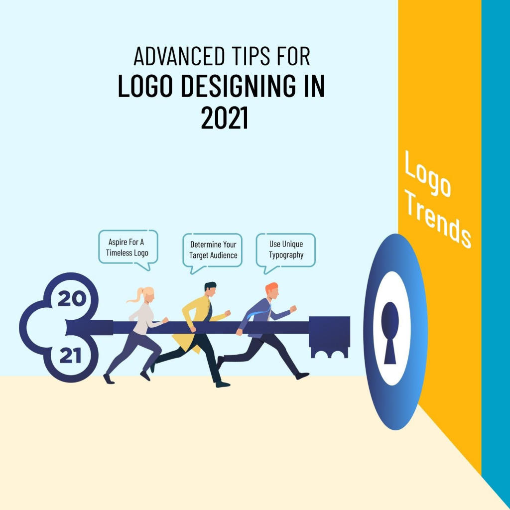
Logo design has more to it than simply selecting a design, colour, and font. It is 2021 and businesses want to convey more through their logos. It is high time that we take a look at some of the strategic ways adopted by any professional logo design company to create a stunning logo. Check out the pointers below to find out some of the most advanced ways to designing a logo.
Top 5 Considerations while Designing a Logo
- Aspire for a Timeless Logo
The golden rule of thumb is to design a logo that survives the test of time. Yours can be a small business but every large enterprise starts that way. Therefore, design a logo that is iconic and timeless. The logo is a powerful element in creating a solid brand identity. The more static it is in the long run, the better!
Take the logo of Coca-Cola logo for example. Its logo goes back to 1900 when the design first came to the forefront. Since then, the colour scheme and the background have been changed but the font and style remain the same. It drives instant memorability – something every brand aspires for.
You need to pick the focus element in your design. First, determine whether you want a wordmark logo or a symbol-based logo. Then pay attention to creating a classic logo that you can use with different background – both white and coloured. It will ensure that you don’t need to change the logo frequently.
- Determine Your Target Audience
You may be familiar with the idea that your logo should sync with your brand identity and reflect the core message of your business. However, these days, the experts of logo design services recommend taking the target audience into account while creating a logo.
And they have every reason to recommend so. A logo is a branding tool and the golden rule of branding is that it must connect with the audience. Therefore, the logo should appeal to the audience and appeal to them.
For instance, if your brand caters to the premier class, it should be sophisticated and fancy. On the other hand, if your brand caters to children, an animated logo is the ideal pick for you.
The target audience will occupy the centre stage in 2021 and beyond. Therefore, it’s time to focus on the consumers instead of solely your business nature.
- Pay Attention to Scalability and Extendibility
From websites to brochures and digital marketing platforms – your logo will find a place everywhere. In fact, there are times where you may not place your brand name but the logo will drive memorability.
Therefore, the logo must be scalable and appealing on any and every platform. During marketing, you may get limited space to feature the logo. Therefore, the logo must look compact yet properly visible in a tight space.
Further, the logo should look attractive on both digital and print media. This underlines the principle of extensibility. This is useful especially when you engage brochure design services to create a business brochure or print the logo on your sales package. Make sure that the logo looks attractive no matter whichever colour you pick for your brochure or packaging. The best way to ensure it is to check the logo by using different colours in the background.
- Create a Thought-Provoking Logo
Imagine a logo of a cafe with a coffee cup. It has everything that a logo design demands – simplicity, straightforwardness, and relevance.
But it misses one thing – depth.
The difference between an ordinary and an extraordinary logo is that the latter drives multiple interpretations or has a depth that is revealed only after pondering over it for some time. It encourages the viewers to think about the logo and upon the revelation of the deeper meaning, get amazed. This, in turn, compels them to remember the logo for a long time.
Here are a few examples. The arrow sign built by the negative space in between E and X in the logo of FedEx is something intriguing. The viewers, upon discovering it, get stunned. Again, the arrow sign from a to z in Amazon underlines their range of services. This is the in-depth meaning of the logo.
While your logo should not be complex, an element of depth creates a layer in your design and makes it more intriguing to the audience.
- Use Unique Typography
While designing a logo, steer clear from generic typefaces in favour of unique typography. With hundred other reasons for hiring a professional logo designer instead of using an online logo maker, this is yet another reason.
While free logo making tools available on the web use generic typefaces, the professionals can create unique typography which helps you to stand out. If yours is a wordmark logo, there’s no way you can grab attention from the viewers using common typefaces.
However, when we say “unique”, we don’t mean too complex that goes to the extent of becoming unreadable! Make sure it is easy on the eyes.
Following these five handpicked tips will ensure that your logo is way ahead of your competitors and can survive the test of time. Implement these and feel free to share your thoughts with us.

